Synergy Relational Therapy
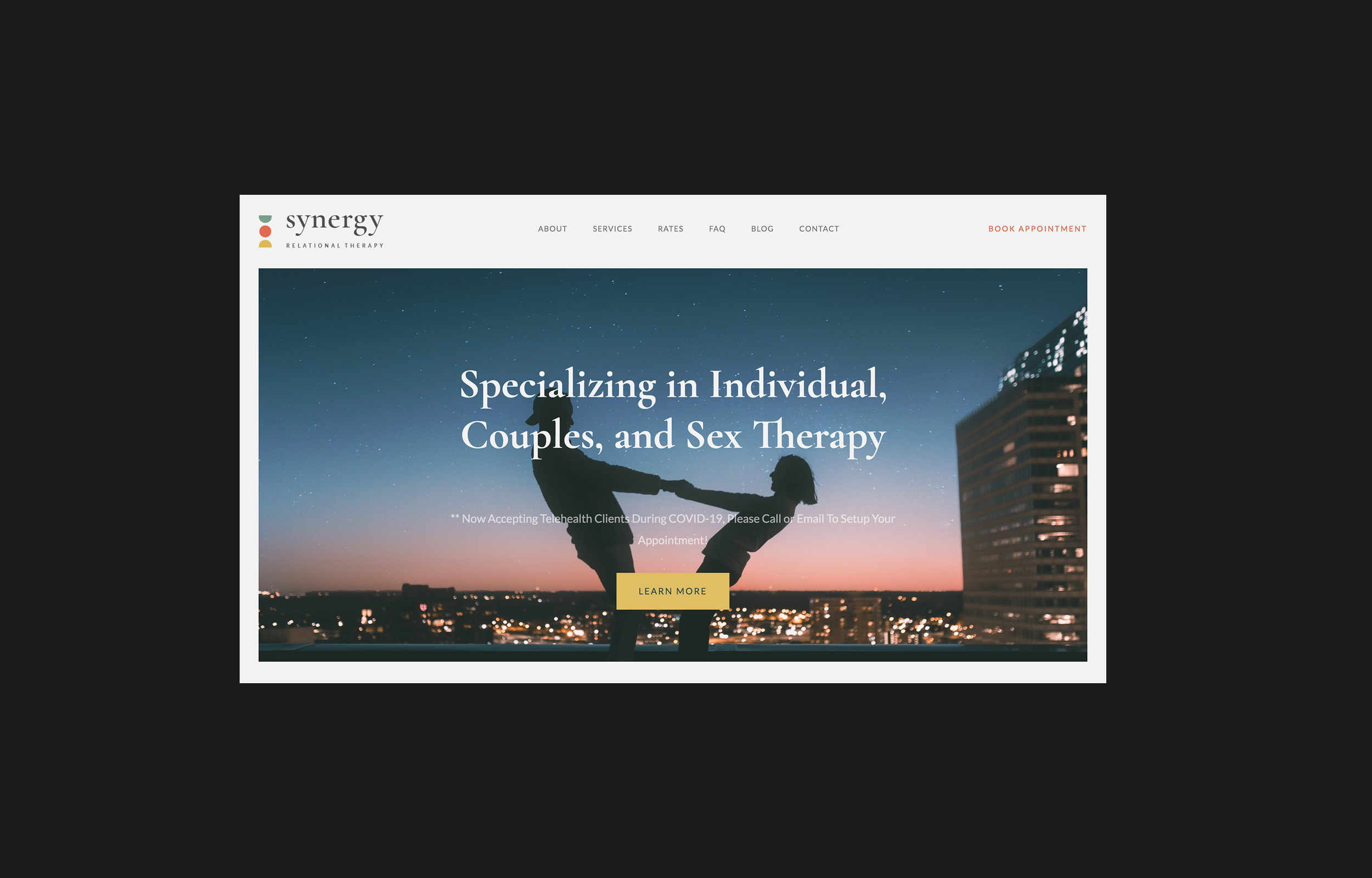
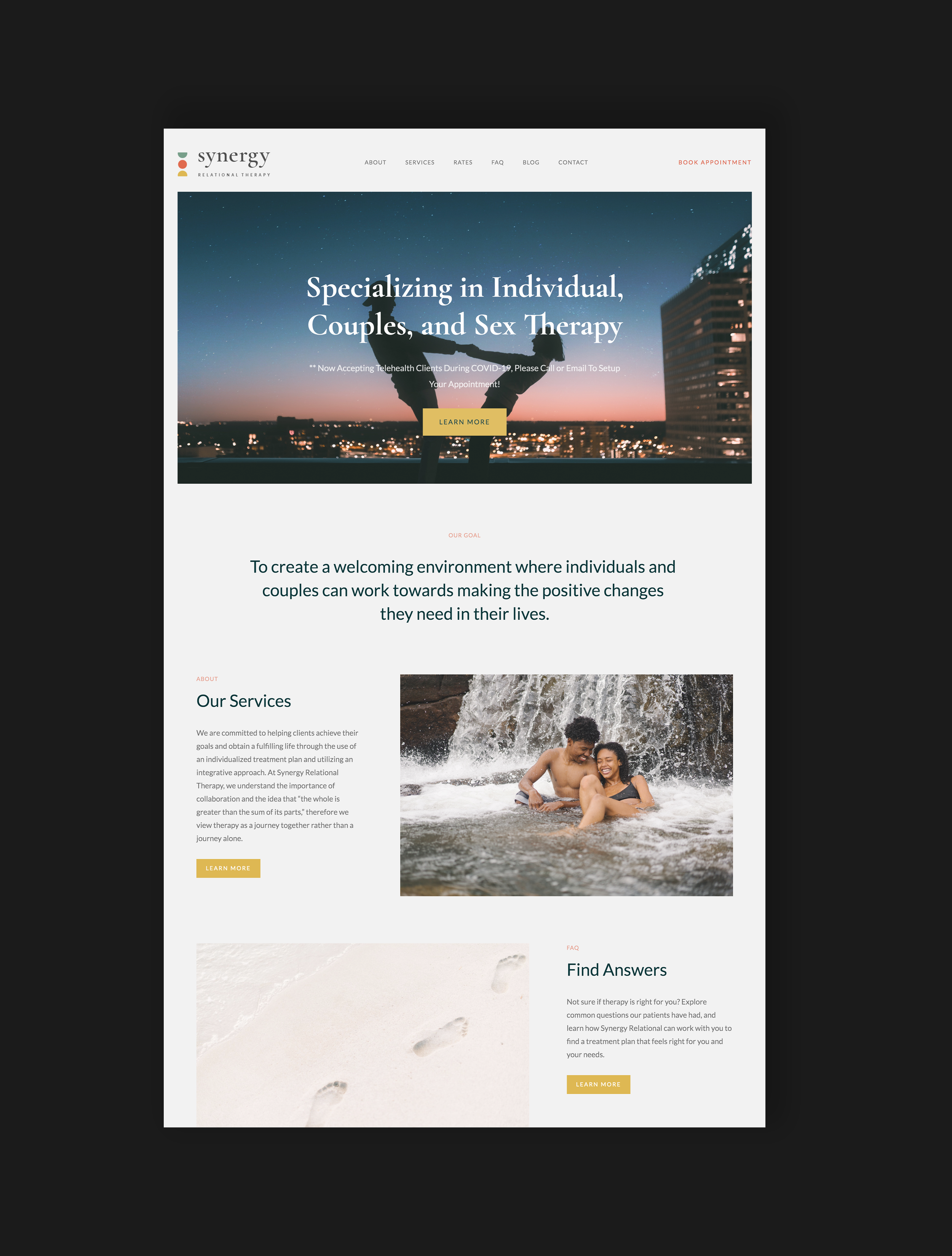
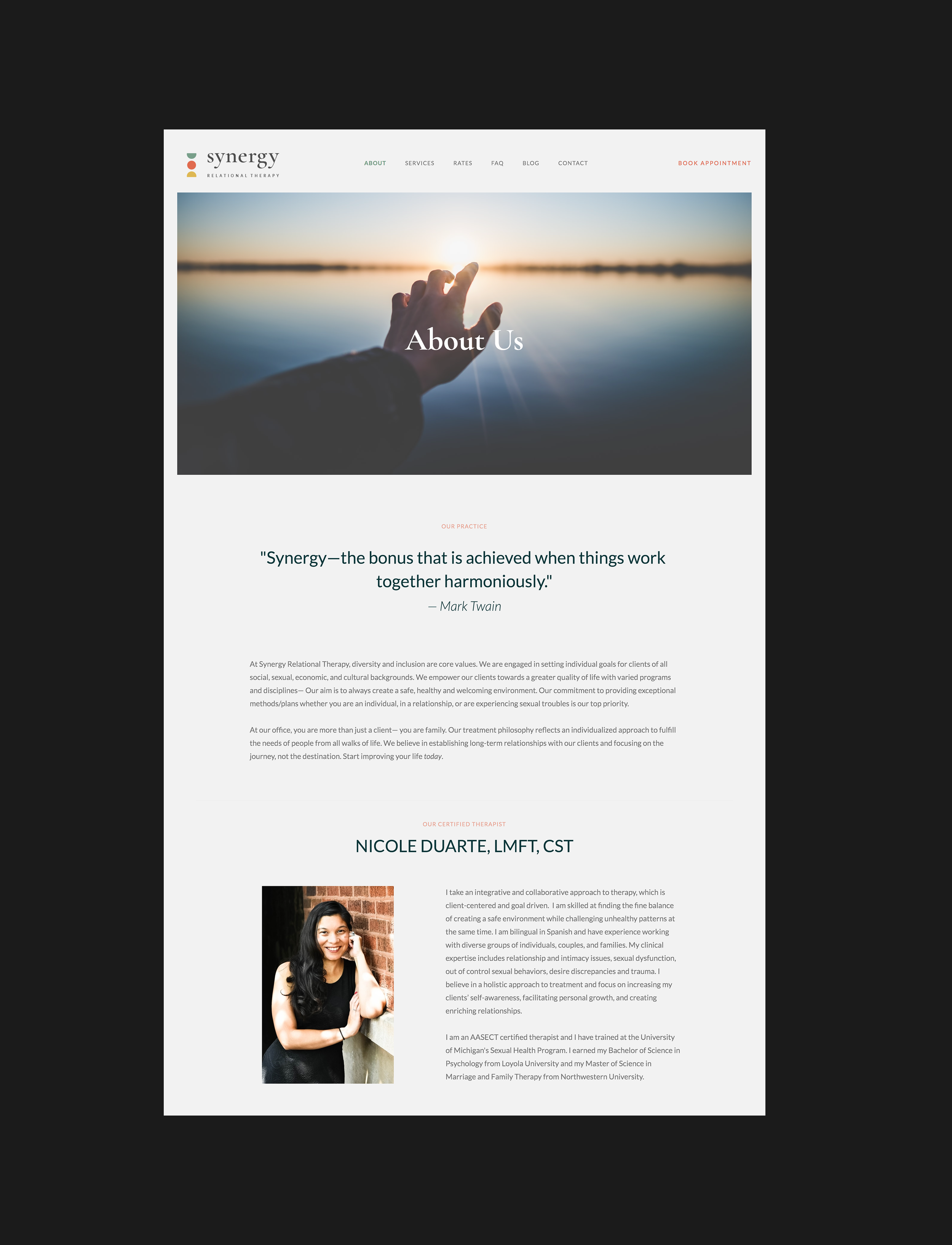
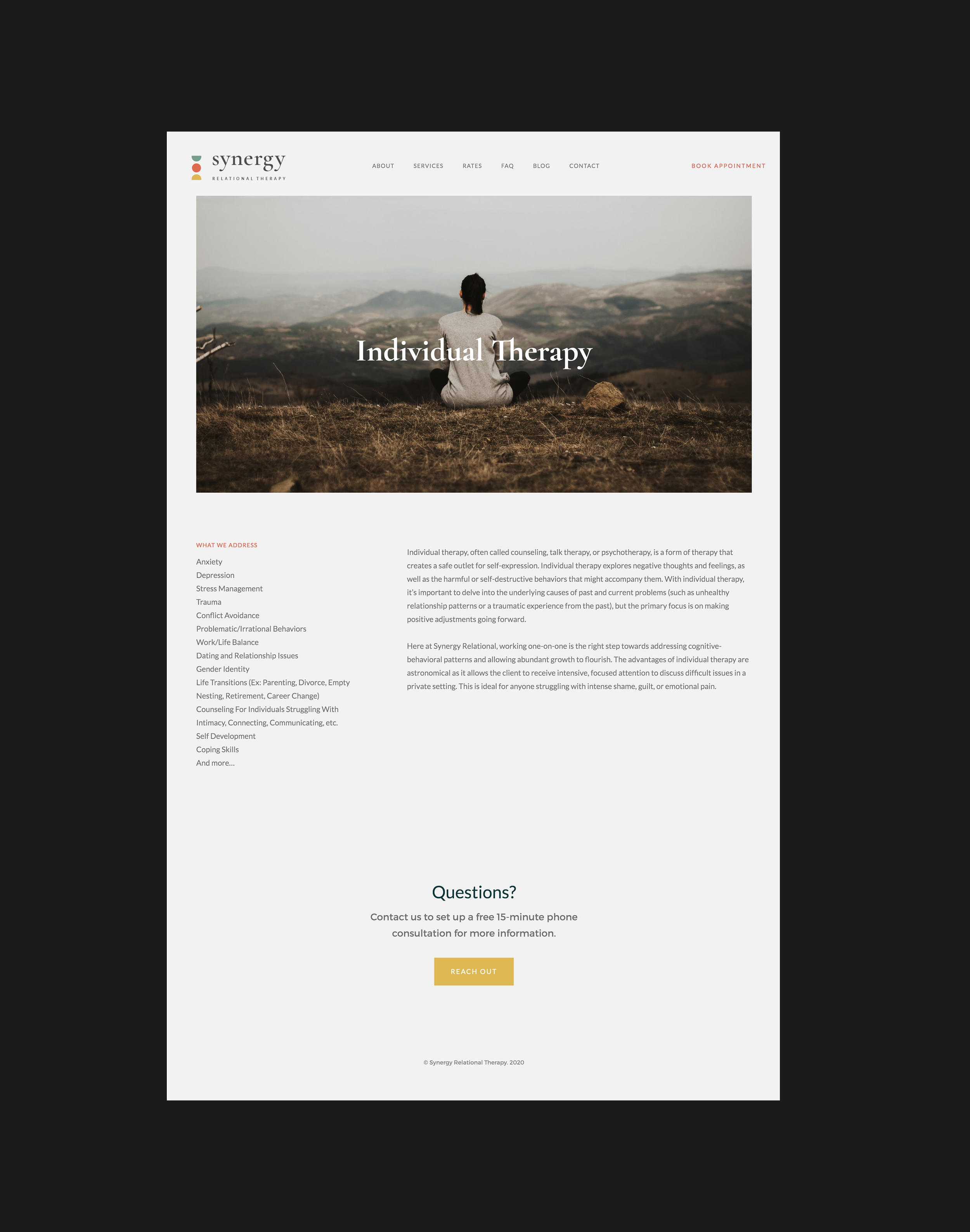
The client reached out for a logo and website redesign for her expanding therapy practice. The website would function as both a scheduling tool for her patients and a free and accessible resource on sexual and relational health topics. Her mission is to create a safe, nonjudgmental, and hopeful environment for individuals and couples exploring the health of their sex lives and relationships.
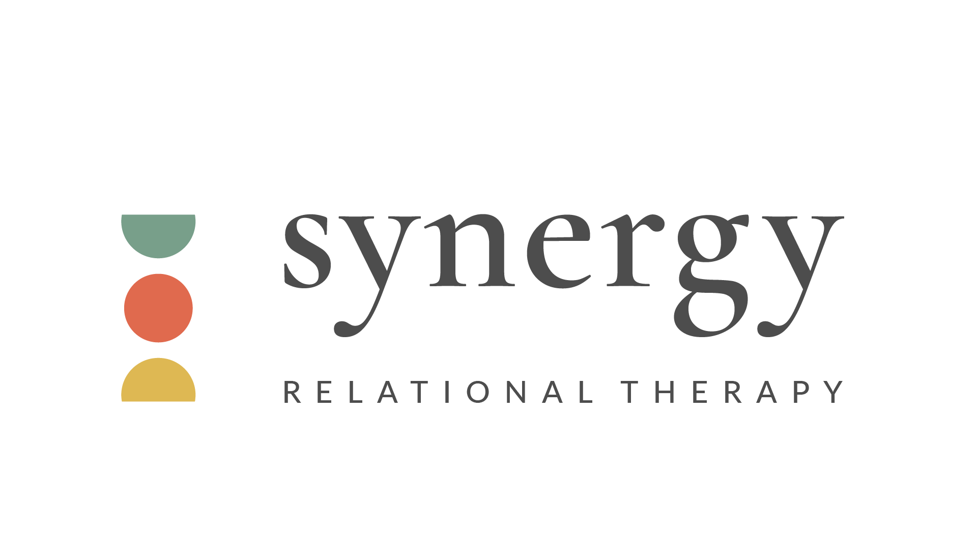
We chose a color palette of softened primary colors to represent a return to the basics. The logo symbolizes balance, transition, and a center equal to the sum of its parts. The yellow semicircle can be seen as a sunrise, the red circle represents the sun, and the blue semicircle as the sun’s reflection on the moon. The website imagery exhibits nature, harmony, and fun—what healthy sex lives and relationships thrive on.
